SITE: Ryerson University Student Learning Centre, Toronto, Ontario
ARCHITECTS: Snøhetta (Executive Architect) with Zeidler Partnership Architects
PHOTOGRAPHY: Karimah Gheddai www.karimahgheddai.com
Hi beautiful people! Welcome to my very first post on my new blog! I am so happy to have you here, where you will get to follow my journey exploring the wonderful city of Toronto, Canada including exploring the architecture, landscape, food, cultures and lifestyles that make this city so beautiful. The first blog post is focused on my visit to the Ryerson University Student Learning Centre, located near what I would call the heart of Toronto's downtown; Yonge and Dundas.
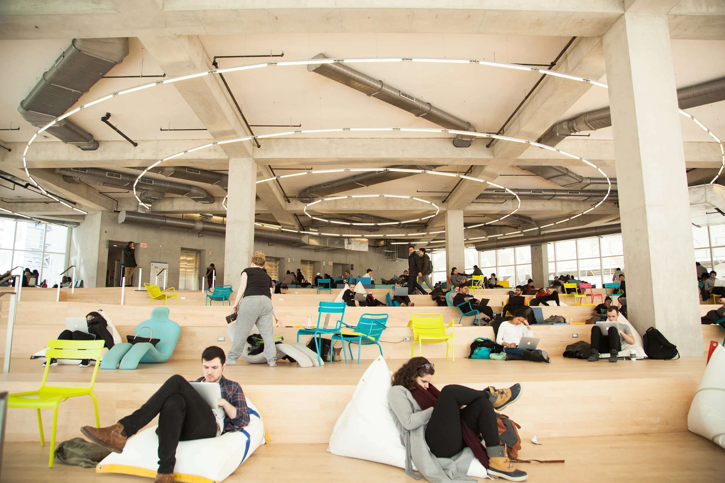
The Ryerson Student Learning Centre is a fairly new building that was completed in the year 2014. The Norwegian design firm Snøhetta along with Toronto architecture firm Zeidler Partnership Architects of Toronto were the architects behind this marvelous structure. The building has 8 uniquely themed levels and comprises of 14,200 square meters. Each of the eight floors was buzzing with students, who took their pick of study/ work area based on their needs whether it was a quiet study space or an informal setting for their group work and discussions. Some students also chose spaces based on their ability to take a nap/siesta on the comfortable seating (Hey I did not know one could nap in a study area).
It is said that the building design took it's inspiration from the historical gathering spaces of the Stoas and agoras in Ancient Greece . These spaces were said to have been very much social spaces and in today's digital world learning has truly become a social activity.
THE ENTRANCE
THE FIRST LEVEL
Hand Folded Metal Panels provide a beautiful futuristic looking ceiling to look at
This beautiful Wood Kiosk/booth was where one could find further information on the building but at the time we visited no one was manning the booth so we had to go up to the second level.
Taking the stairs up to the second level. I absolutely loved the use of wood here!
THE SECOND LEVEL
The student staff at the University were super friendly! Here they are directing me on which parts of the building to see.
THE GARDEN (4th Floor)
As you can see below this floor was very green! Here one could find reception services, academic support programs and a generous amount of spaces meant for workshops as well as open spaces for studying and Relaxing.
THE SUN (5th Floor)
When they named this floor "The Sun" they really must have felt it! This space was a boost of energy to the system due to the beautiful use of the colours red and orange that made you feel energized!
THE BEACH (6th Floor)
Quite possibly my favourite floor in the building! This level was designed to look like a beach and even some of the furniture mimicked the lounge chairs you might find at a beach.
THE FOREST (7th Floor)
The forest is a beautifully laid out space however as this was designated as a quiet study area we were not able to explore as much or take a lot of photos. I did however love the lighting here!
THE SKY (8th Floor)
This level was quite bright due to the amount of sunlight let in by the Windows. This level was possibly the busiest from all the levels that I visited.
LANDSCAPE
Next we explored the surrounding landscape of the University. There were some beautiful trees in the vicinity and we happened across a skating rink that was surrounded by huge boulders which was located right beside the Ryerson Image Centre which is a hub for photography.
Thank you for looking through my first blog post! I would love for you to continue exploring the beautiful city of Toronto with me through this blog. Until next time wishing you love and light always!
-Katia


